Riešenia
Every equation has its solution
assignmentThe online agency Riesenia has been operating on the market since 2005. They asked us to refresh their visual identity to differentiate themselves in the category of digital agencies in Slovakia. They struggled with unclear naming and unnoticeable brand collateral.
processAfter defining the client's assignment, we prepared a creative brief that contained clues we could grab onto when designing brand assets. We agreed on this revised assignment with the client and started creating.
When designing the logo, we used the indication of three core competencies of the agency. We combined the original claim "technology, strategy, performance" into a fictitious equation that directed us to a meaningful logo, narrative and tagline of the brand:
“Every equation has its solution.”
outcomeThe visual identity distinguished the agency by a logo that refers to the nature of the agency's brand and core competencies. The client quickly identified with the new logo and accepted the message of the new identity.
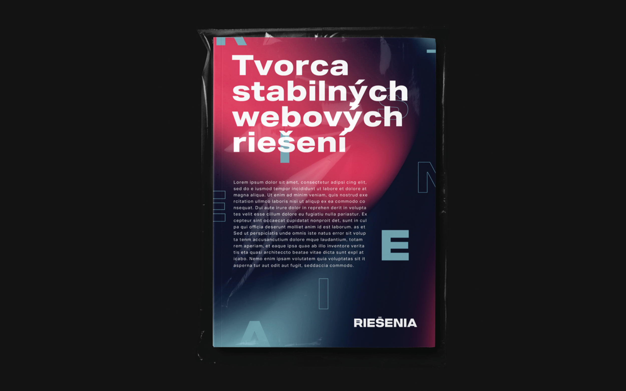
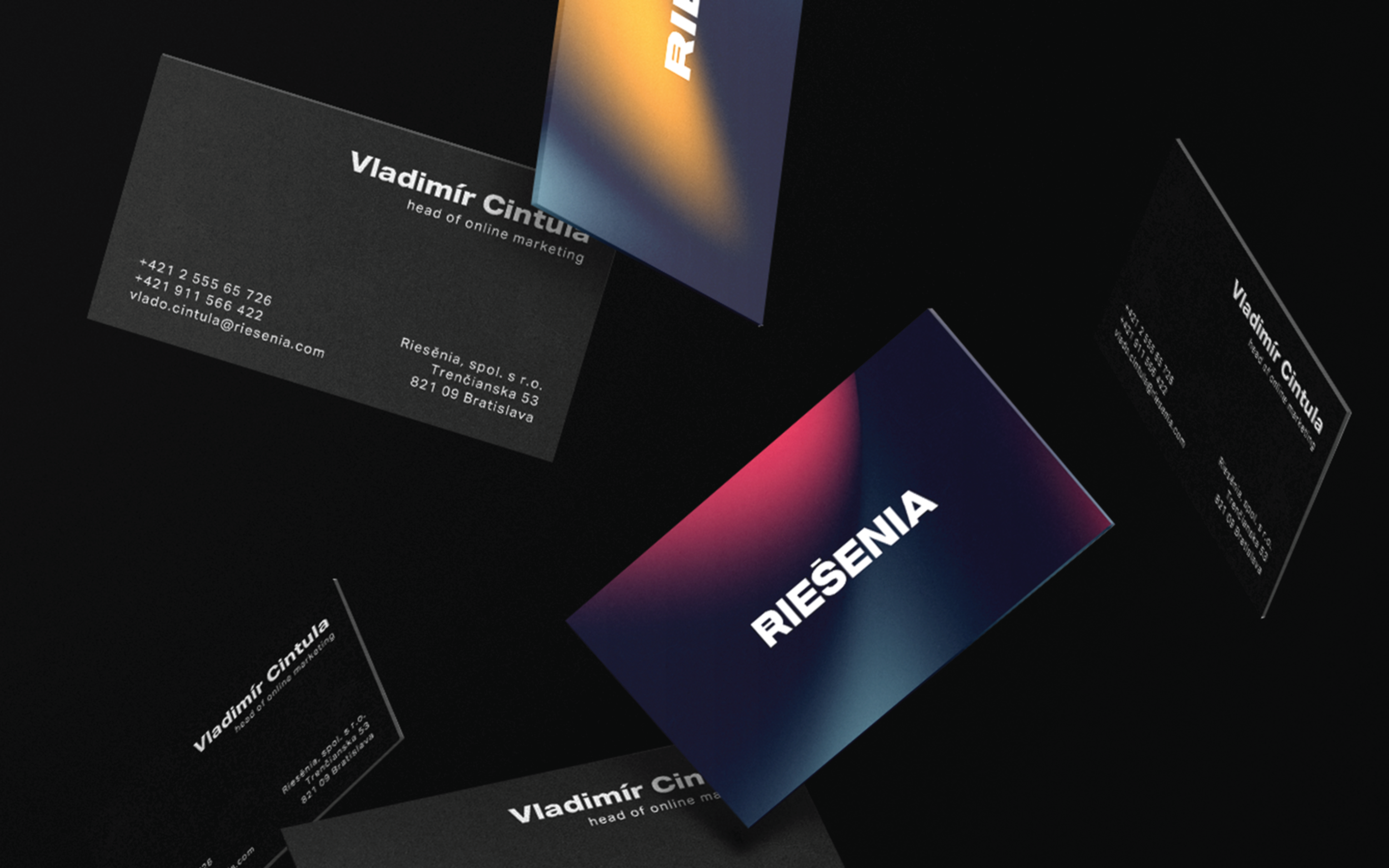
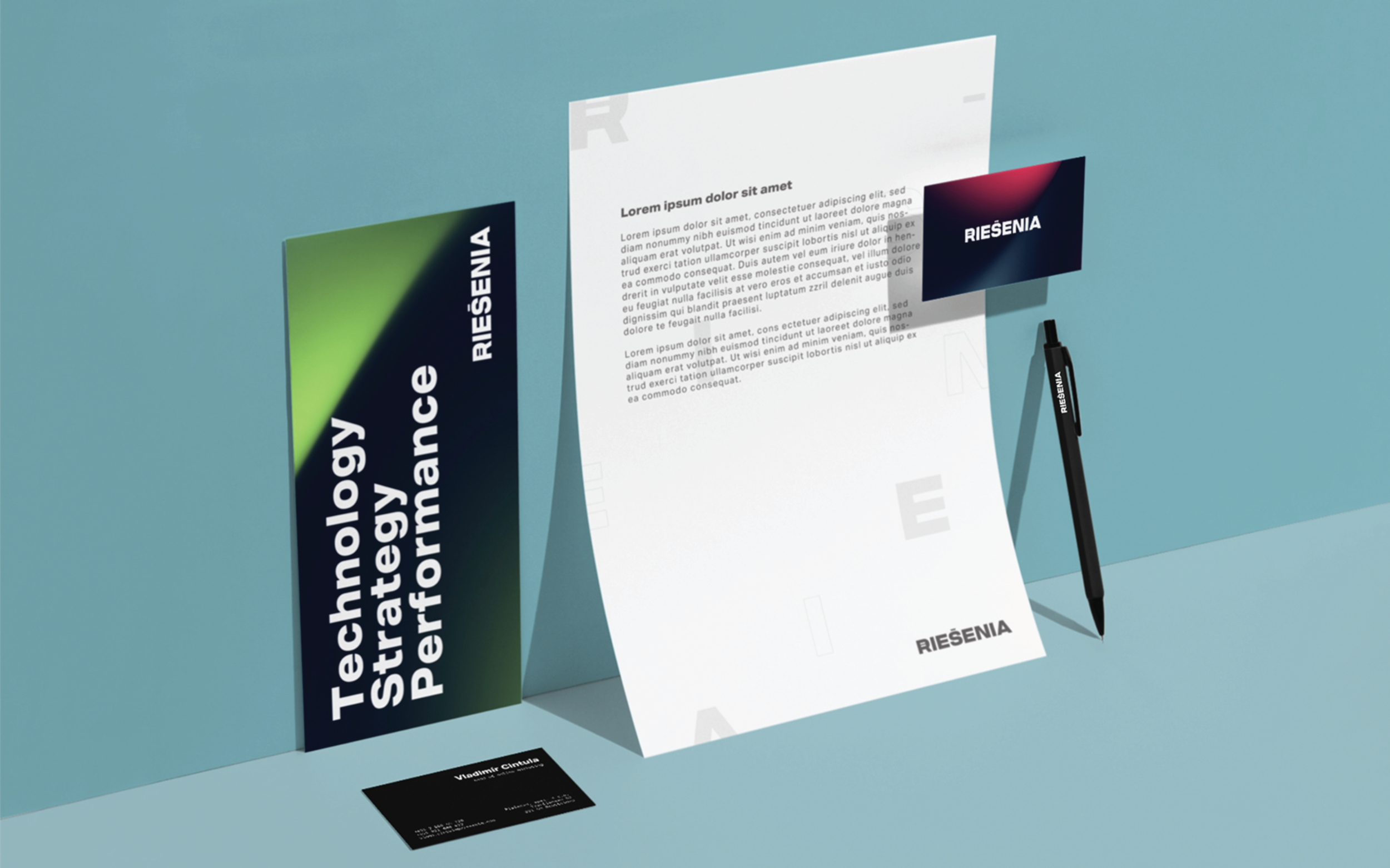
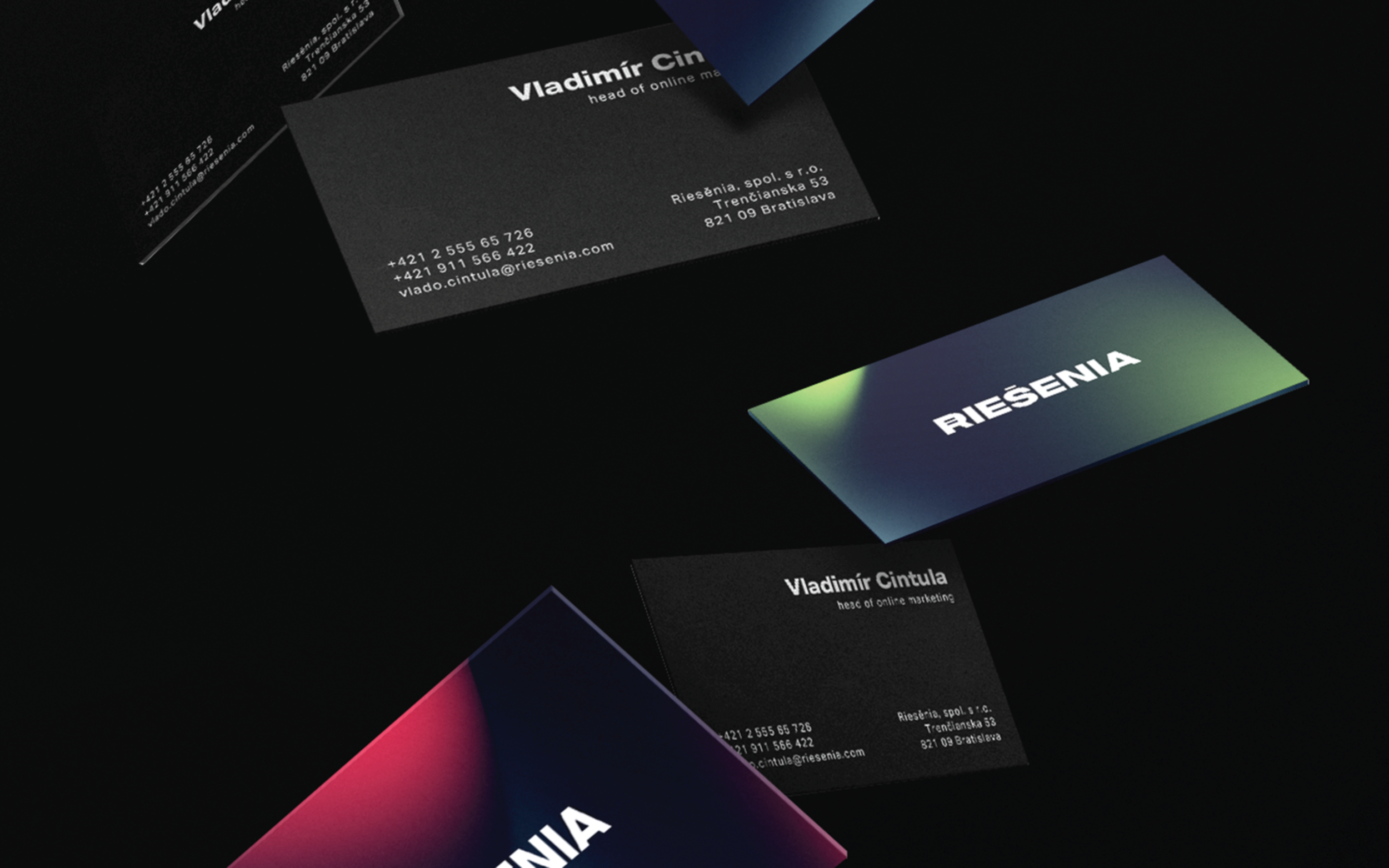
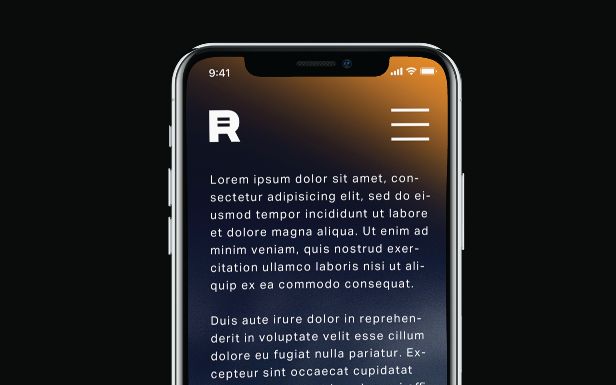
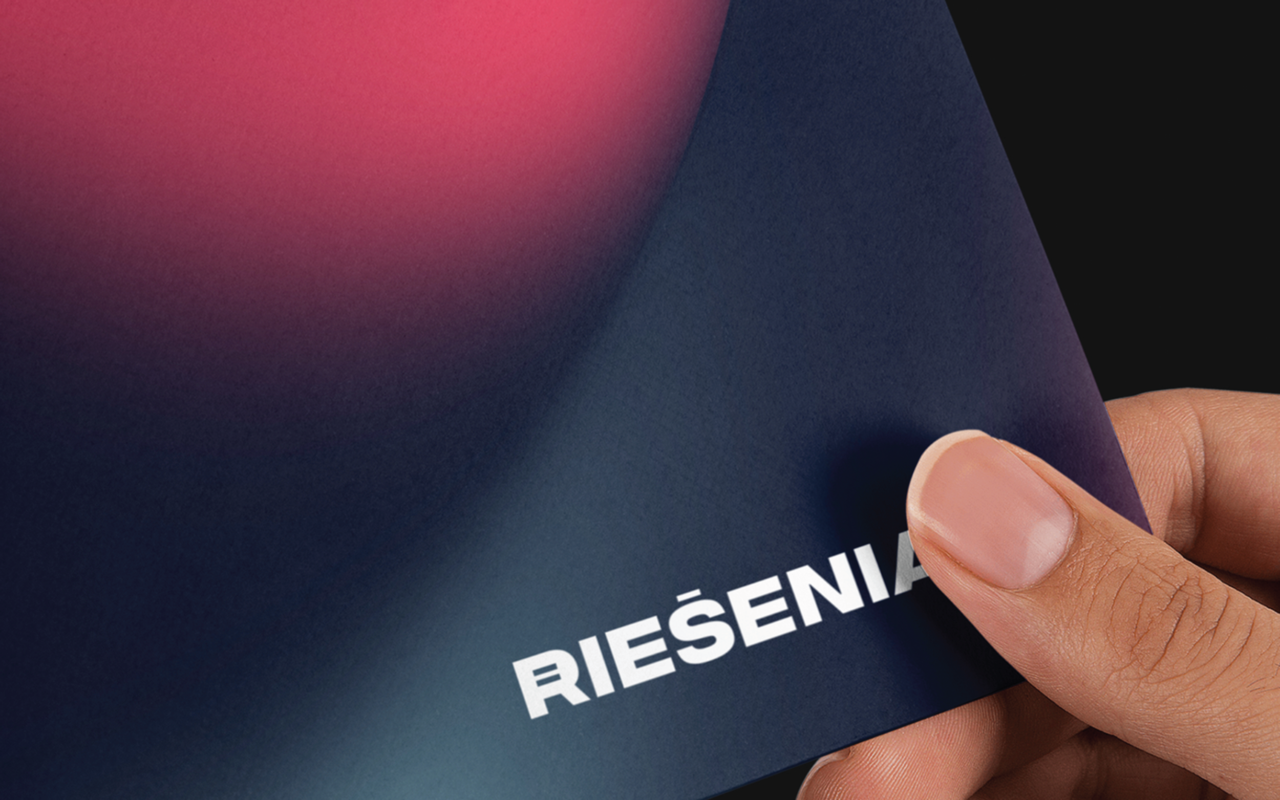
We standardized the name with a single logotype that is appropriate across all brand touchpoints.
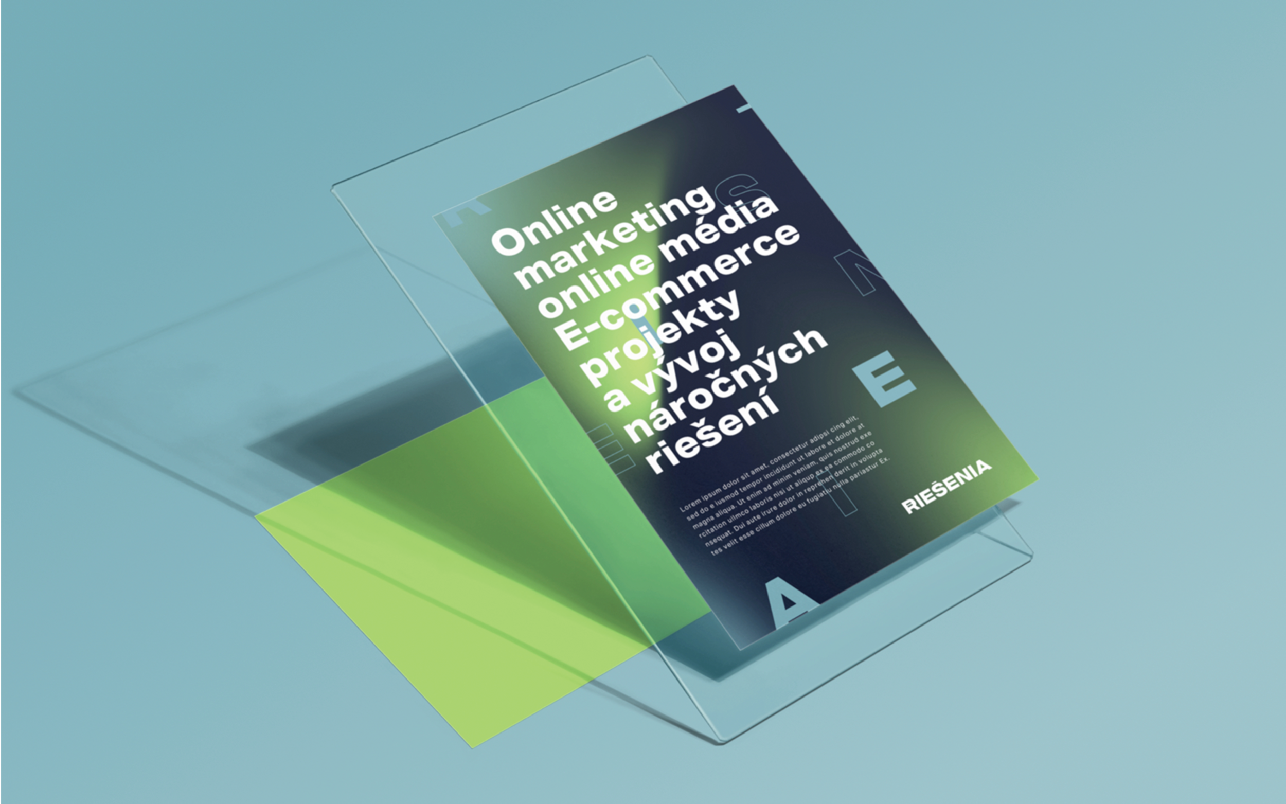
The identity also uses a pattern made up of the typography and color gradients to differentiate the agency's divisions: e-commerce solutions, digital strategy and performance advertising.